If you want to know how to present data:
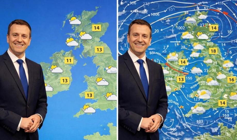
- Study a typical TV weather map, as in the image.
.
On the left, a classic example of good practice.
But on the right, a disaster of my making.
One is easy to understand, one is baffling.
See how simplicity is key?
.
Think of it this way whenever you give a presentation:
- The more information you use, the less will be remembered.
- The less information you use, the more will be remembered.
.
The classic danger of data is having too much.
Be ruthless. Use the minimum possible to make your point.
Remember the golden rule:
- Less is more.
.
Force yourself to choose just one point to make per slide, and select your data accordingly.
Just like the fine example of the weather forecasters.
.
The image on the left is about temperatures.
The one on the right is about everything.
And thus it communicates nothing.
(Or, at least, nothing readily comprehensible.)
.
If you think you might need to go into more detail with an audience, you can always have it on standby.
Preparing extra slides for under the black line of a presentation is a favourite trick of mine.
Come the question and answer session, if the issue arises, you can select the slide of choice.
.
When dealing with statistics, doing data storytelling - or data visualisation, as it's also known - always remember:
- Less is more.
.
And if you've got more information on a slide than you'd see on a TV forecast...
That's a red weather warning:
That your message is likely to be lost.