Simon Hall writes:
I never use white as a backdrop for my slides when presenting.
On a purely practical level, it can look overly bright, and even dazzling.
But there’s a more subtle reason, which is worth thinking about…
Because it can help you impress and achieve your aim, whether it’s a sale, backing for your idea, or getting a job.
The reason I tend not to choose white is, for me, psychologically it projects a sense of coldness and sterility.
And that’s not something you want your audience to feel, whoever they may be.
You ideally want them warming towards you, feeling engaged, not detached and remote.
The impact of colour on the emotions can give us a small advantage when presenting…
And I’m a great believer that any edge we can get in such a pressured and important situation, we should take.
So here’s my trick:
Most presentations have a big crease in them.
- The before and after situation
Generally, you’re advocating a course of action…
Whether that's making a purchase, adopting a new idea, or even employing the keen and talented (naturally!) you.
You outline the problem, the current situation…
Then comes the crease, as you move onto how much better life could be if your audience adopts the course of action you're arguing for.
Which offers the opportunity for my sneaky trick.
Before the crease, when I’m talking about the current situation…
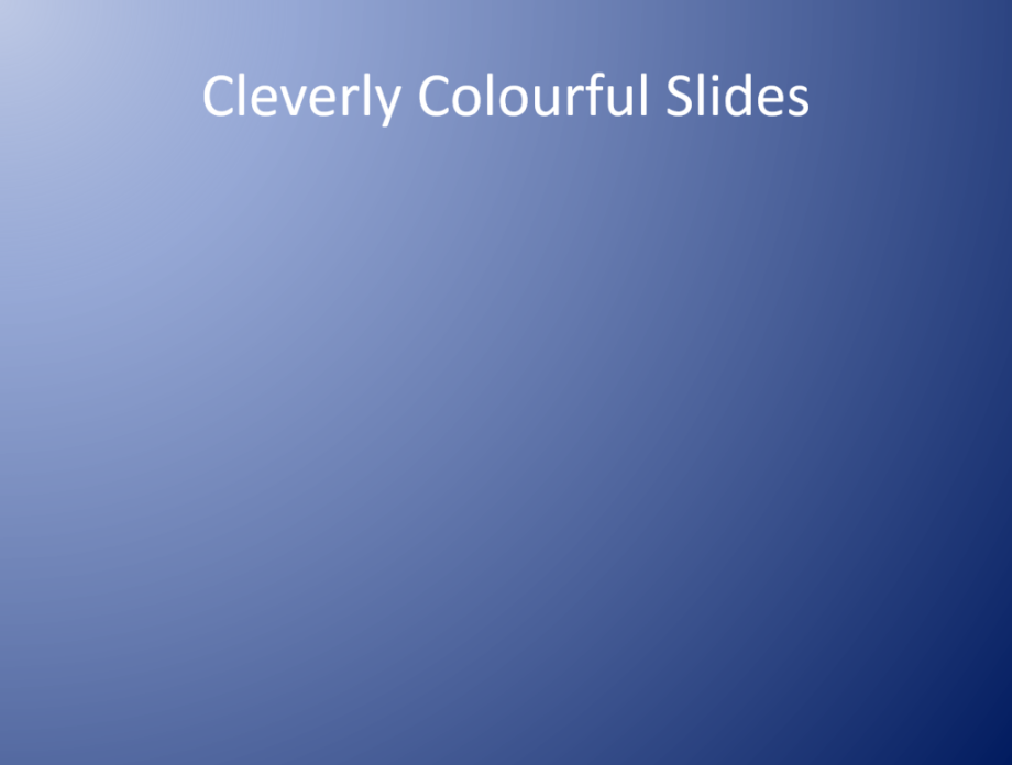
I make the backdrop to the slides darker.
Which subtly projects unhappiness, problems, and concerns.
For example, if I was pitching Creative Warehouse, my company, for a job renovating a dodgy website, the existing position slide might look like this…

Then comes the crease, the moment we switch to my vision of what the new website might look like.
And for that, surprise surprise…
The background to the slide is a very different colour.

Why did I choose a shade of purple?
It’s because purple is often associated with success, and for me just seems to work.
Notice the shifting colour doesn’t have to be stark.
I wouldn’t go from jet black to blazing purple.
I find a more subtle shift of colours works best in terms of subliminally moving the mood of an audience.
There’s a caveat to this, in that colour psychology is very subjective.
Have a read around. There’s a lot of disagreement, and it’s certainly an interesting subject.
But I can tell you it feels like this is a trick which works for me.
Which means, given the nature of psychology, of course, it’s more likely to do so!
And although I have no scientific backing for it, from my observation of audiences…
They have seemed to be more engaged, interested, and impressed after the point when I change the background colour of my slides.
But if you’re still not convinced, there’s a very famous film where the boundary between dull and ordinary...
And then exciting and new is marked by a shift in colour.
Can you think what is it?
Scroll down for the answer…
(You know how I like to tease!)
And the answer is...
The Wizard of Oz.
So if it works for Hollywood...


