Some features of modern life make me sigh, and often much worse.
Although not on this occasion am I talking about (prepare for rant list)...
Wandering along gazing at a mobile phone, playing videos loudly in public, or indeed wearing socks with sliders (it doesn't matter that it's fashionable: it looks ridiculous).
.
No, here I’m talking about the modern tendency to abuse slide decks.
This is an issue which has come up repeatedly in my teaching, and most recently on the latest run of my course.
.
We teach the classical (and proper) use of slide decks, which is to say for presentations.
That means using slides to support your talk, NOT the other way around.
Which requires minimal information per visual, keeping it simple, no more than a few words, complete and ruthless clarity.
This kind of thing, if I were talking about wellbeing:

A title so it's clear what we're discussing, sub headings, animated up, one after the other, to outline the various areas to mention.
Simples.
.
What then is the problem?
It's that slide decks are no longer just being used for presentations, as they were intended.
Instead, they've also become briefing documents.
.
One of our lovely learners on this run of Compelling Communication Skills put it beautifully:
- I try to stick to the principles of keeping slides simple and minimalist, but my company also uses them for pre-briefings, detailed reports, and post meeting briefings. How do I deal with that issue?
.
The answer, I’m sad to say, requires a bit more work.
- You need dedicated slide decks for each different purpose.
And to make it completely clear to everyone which is which.
.
For example:
With a presentation, take the minimalist approach to your slides, as above.
Remember, the audience gets just one chance to understand what you’re talking about.
The parallel is a TV news story, as opposed to reading an article in a newspaper.
.
In the paper, you can go back, re-read, think about the story, satisfy yourself that you get it, then proceed.
On TV, you get just the one chance to understand.
So simplicity and brevity is critical, which means preparing your slide deck accordingly.
.
But now imagine you have a report to produce, and your organisation likes it in slides format.
This time, and for this purpose ONLY, you can put much more information on your visuals...
As the audience has a chance to read, re-read, think, and digest.
You can also put lots more information in the notes section.
So here, a far busier slide is fine. Again, if talking wellbeing:
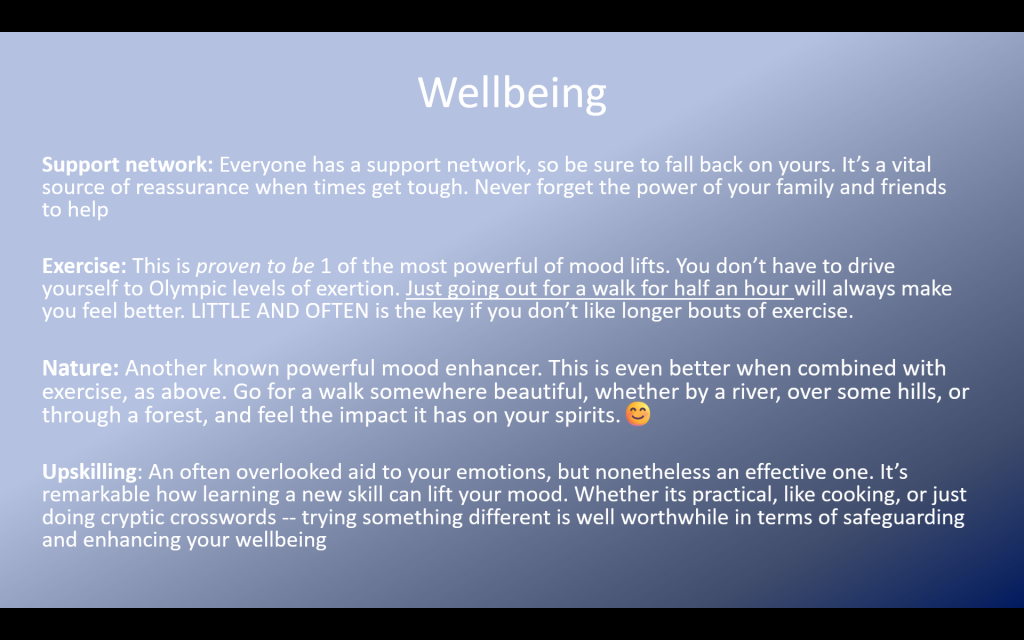
That's fine for reading at leisure, but wouldn't work in a presentation as it doesn't follow the golden rule:
- The audience is either reading the slide, or listening to you, BUT NOT BOTH.
Which leads to the critical requirements for clarity, brevity and simplicity.
(Yet how often do you see slides like the above, an assault of words, in a presentation - yuck.)
.
The key point is to make absolutely clear which approach is which.
You can put them together in the same PowerPoint, but make sure you:
- Use BIG AND VERY OBVIOUS TITLE SLIDES to divide the separate formats.
That way, it's super obvious which version of the content you should be looking at:
Whether designed to be the live presentation to an audience, or - following a big, clear dividing slide - the set designed for reading at a desk.
.
Frankly, using slides as a report is an abuse of their purpose.
Why not just write the report, if that's what's required?
It's a classic hack, designed to save time, which doesn't actually work.
I can promise you that a slide deck will fail if you try to use it as both report and presentation.
.
But I’m aware you have to be a realist in this world.
So, for practical purposes, do what your organisation demands.
If reports really must come in the form of slide decks...
That means two different decks are needed, whilst making it absolutely clear which version of your work is for which different purpose:
- A presentation to an audience, or a briefing to read at your leisure.