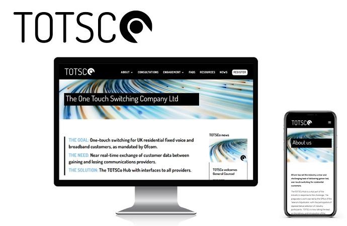
The logo represents ‘one touch’ and uses a modern sans serif font in a neutral black as the Telecoms market is awash with colours fighting for colour/brand recognition, and to emphasise its professional stance. The first-stage website used a single brand image so as not to get into the way of what is most important - the meetings and reports that will pave the way for compliance to work.
TOTSCo – The One Touch Switching Company – is a not-for-profit company owned by its membership. It was set up to allow providers to comply with Ofcom’s new regulations to make it easier for residential customers to change their fixed voice and broadband service provider.
The TOTSCo Hub is the name given to the messaging platform that will carry customer details and other required data and messages between gaining and losing providers.
The logo represents ‘one touch’ and uses a modern sans serif font in a neutral black as the Telecoms market is awash with colours fighting for colour/brand recognition, and to emphasise its professional stance. The first-stage website used a single brand image so as not to get into the way of what is most important - the meetings and reports that will pave the way for compliance to work.
Angie of Fuz is... responsive, creative, resourceful!
Paul Bradbury, CEO, The One Touch Switching Company Ltd