Borne was commissioned to work on a rebrand for Virgin Wines – which entered the market 20 years ago to revolutionise the fusty connoisseur market but needed to shift perceptions and elevate its value in an increasingly crowded marketplace of wine businesses.
They wanted to strengthen the brand association with Virgin, and elevate the Virgin Wines brand so that it wasn’t just recognised, but recognised for something. “With an elevated brand, we aimed to deliver long-term commercial value and a tangible, positive impact on Virgin Wines’ people,” said Nathan Wadlow, Brand and Digital Marketing Director, Virgin Wines.
It was about creating better recognition, more differentiation and reinvigorating a market standing and sales – and early research reinforced why. Surveys showed low brand association with buying expertise and ‘premium’. The potency of the Virgin Wines brand had become diluted amongst visual ubiquity across its competitors – losing the personality and human ‘real’ feel so important to modern brands.
And Virgin Wines has a strong story to tell: whereas the subscription wine industry relies heavily on offers, Virgin Wines represents quality, and skill, with buyers titled the best in the world amongst its roster. They don’t just trade, they’re creators and connoisseurs: using reams of customer insight to craft original blends with their suppliers. During 2020, the company delivered over one million cases to its customers. In 2022, it was awarded Specialist Online Drinks Retailer of the Year 2022 at The Drinks Retailing Awards.
It was time to shift perceptions of Virgin Wines to, rather than joining a race to the pricing bottom, elevate the brand and its associations with premium wines.
Putting ‘joy’ at the centre
Virgin Wines came to Borne with a new brand positioning and purpose: ‘To create joy from grape to glass’. Like them, we saw the power in joy. There’s joy in the grape, in the glass, in saving money, in good service, opening the box, in special occasions, giving joy to others, in relaxing, in learning – and it’s a strong emotion, that we remember.
We wanted to make ‘joy’ the differentiating factor for Virgin Wines – it’s something none of the competitors were doing. And it plays into the role of all Virgin brands of standing out by creating extraordinary experiences.”
Borne’s response was a brand sentiment – a design idea that would govern the design decisions – built on this: ‘A joy that flows naturally.’
‘Joy’ – What differentiates Virgin Wines as a brand.
‘Flows’ – Talks to the product and ease of buying wine.
‘Naturally’ – Gives Virgin Wines a human feel and has nice product connotations with wine, such as grapes and vineyards.
This set them in a clear direction. “It’s so hard to distil a brand to a single thought, an idea – but it’s so important,” says Darrel Williams, Borne’s creative lead on the project. “It joins every aspect, from a search button on a website that says ‘get it now’ rather than ‘order’, to a logo, an image, a font, a tone of voice.”
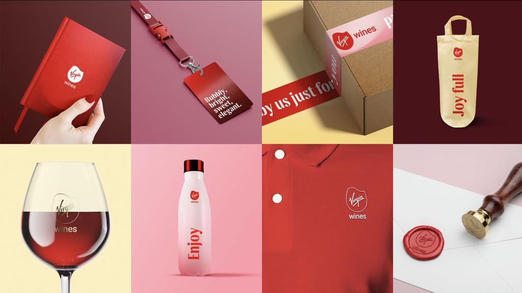
A new logo and bespoke font
We wanted every touchpoint with this brand to be joyful – and swirling wine allows you to release the layers of aromas which enriches the smelling and tasting experience.
The logo moved from a table’s wine glass mark, to a ‘swirl’ of wine in the glass before your first sip. A simple, adaptable mark that included a low-ink version, reducing its eco impact.
The colour was partially dictated by insight that identified the Virgin master brand equity as a key component of Virgin Wines’ USP – a need to maintain the Virgin red. But now, with a supporting colour palette inspired by wines in shades of Malbec, Bacchus to Riesling, with names to match. Used in gradients, to look like wine in your glass as you swirl it, with light refracting through the liquid – and with a subliminal smile in blended colour.
The typography changes were based on the fact that the entire wine subscription service market uses the same sans serif with serif font combination. So Borne moved Virgin Wines from ‘looking like a wine company’ to its own thing: no sans serif, and a custom Dalton Maag font with ‘flowing’ lines, hidden smiles (spot it in the ‘e’) and ‘drops’ of liquid references within the type.
Art direction should always feel as authentic and genuine as possible, but a lot of the wine world feels commercial and staged. Virgin Wines’ imagery previously hadn’t reflected the people and passion behind the business. “We wanted to build on the master brand’s authentic guidelines,” explains Julia Patrick, Design Lead at Borne. “But to take this a step further: we developed photography pillars:
● ‘Putting Product on a Pedestal’ – Where we don’t shoot it in lifestyle settings, but unapologetically focus on the product.
● ‘Celebrating the Detail’ – Focussing on the process that stands them apart: from grape to glass.
● ‘Working Together as a Family – Showing the faces of Virgin Wines, in a candid, authentic and reportage style.
● ‘Joy in the Moment’ – Showing the real and special moments where our customers enjoy our wine.
“Photography is always going to be really important, not just in how we shoot product, but also how the human side of the business, from grape to glass, is portrayed – with four different categories we needed a simple system/direction for each one,” says Julia. “The Virgin Red is an accent tone in the photography, soft focus mimics the grads in our colour palette, and it’s an editorial rather than commercial style.”
The Result
No more ‘hand-written’ text, with low legibility fonts and logos. Now, Virgin Wines looks like the wine business that it is. This sophisticated visual system is distinct, and the ‘A joy that flows, naturally’ feeds through the design decisions, and gives the Virgin Wines team everything they need to make brand decisions moving forward.
“Borne were a fantastic partner to work with in delivering what has been a transformational initiative for Virgin Wines,” Nathan Wadlow, Brand and Digital Marketing Director, Virgin Wines. “They fully immersed themselves in the business from a very early stage – our culture, market positioning, product strategy, and more – which enabled them to grasp a deep understanding of the project at hand, including the nuances of what we were trying to achieve, and why, and the required strategy to meet our objectives. Having an agency partner who committed to this level of understanding, both the commercial and emotive, was incredibly valuable and reassuring.
“Borne has delivered an identity that perfectly represents our brand vision, and we couldn’t be happier with the creative vibrancy and clarity we now have. I have no doubts that the elevated brand will deliver on our long-term objectives and be central to the ongoing success of Virgin Wines. Oh, and we had a lot of fun, too!”
“Borne were a fantastic partner to work with in delivering what has been a transformational initiative for Virgin Wines.”
Nathan Wadlow, Brand and Digital Marketing Director, Virgin Wines.
“Having an agency partner who committed to this level of understanding, both the commercial and emotive, was incredibly valuable and reassuring.”
Nathan Wadlow, Brand and Digital Marketing Director, Virgin Wines.
“Borne has delivered an identity that perfectly represents our brand vision, and we couldn’t be happier with the creative vibrancy and clarity we now have.”
Nathan Wadlow | Brand and Digital Marketing Director